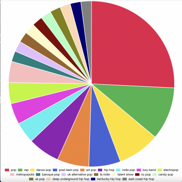
The pie chart tool is one of several tools that attempt to visualise what you have been listening to.
Advertisement
Spotify Pie analyses your Spotify listening habits and puts them into a highly shareable pie chart of all the genres you’ve listened to in the last month.
The website not only reveals your most popular genres but also shows your top artists of the month beneath the colourful chart. Darren Huang, a UCLA undergraduate, designed the website, with the brilliant phrase “Bake your monthly genre pie.”
Advertisement

Spotify Pie exploits the way Spotify categorises each music into highly specific genres.
To use Spotify Pie, you must provide it access to your Spotify data, so if that’s not something you’re comfortable with, pass on this one.
Here’s how to use Spotify Pie if you’re okay with giving your data: Go to the website, sign in using your Spotify account, and accept to let the website share your data. And you will have your large pie!


Leave a Reply